moodboard
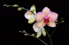
Artist research - billy kidd
|

|
|
|
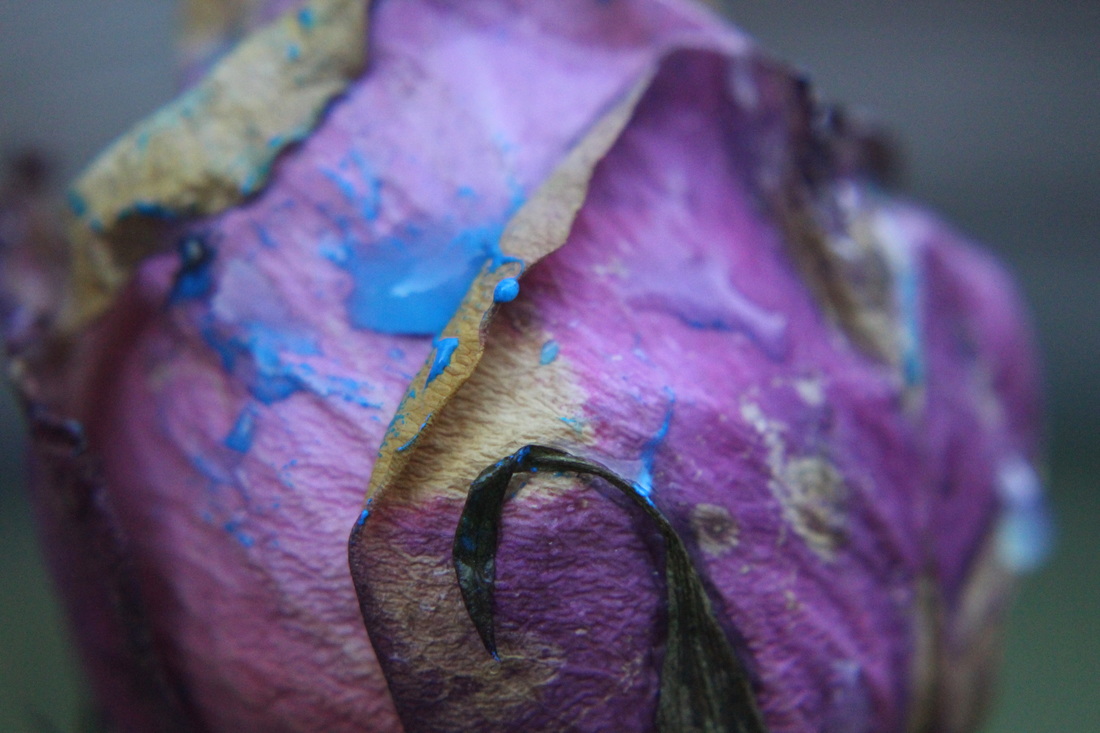
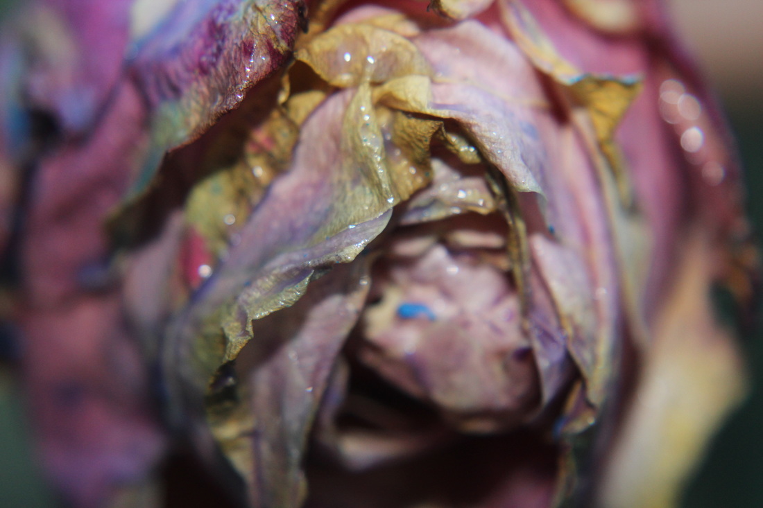
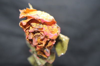
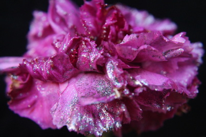
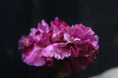
Billy Kidd is a self-taught photographer, born in 1980 in Florida. Based in New York his series called 'decaying flowers' conveys the natural beauty of decay, even in death that there is something beautiful. He uses flowers that convey emotion for example the roses convey emotions of love, and lust. Kidd uses the natural colours of the decaying flowers, the yellows of the decay complement the colours of the watercolours artificially added to the flowers. Kidd often captures beauty people often dismiss.
Top 2

|

|
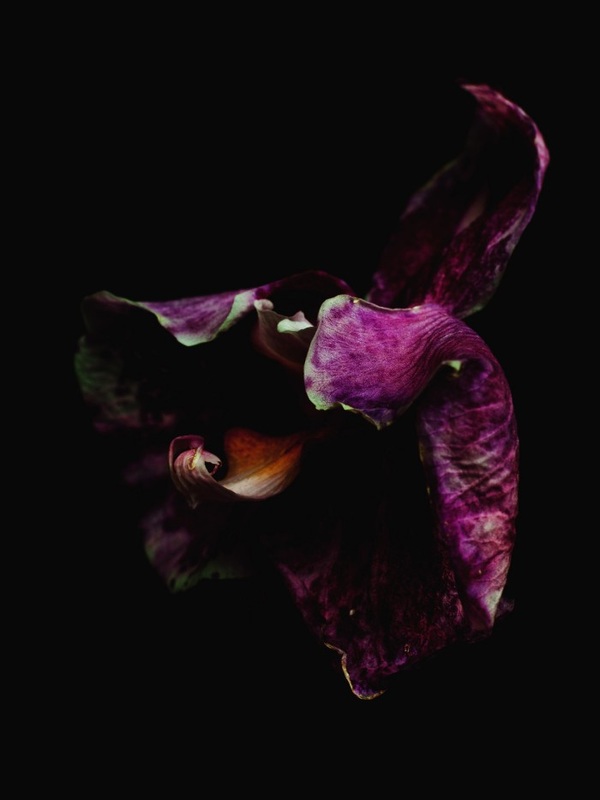
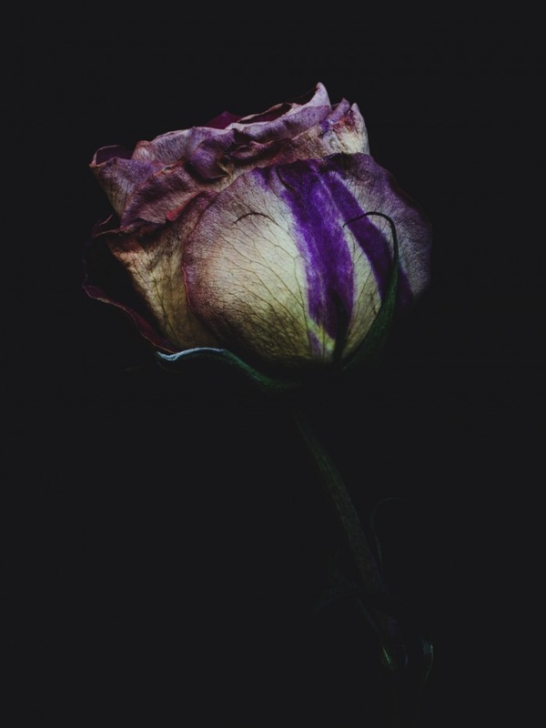
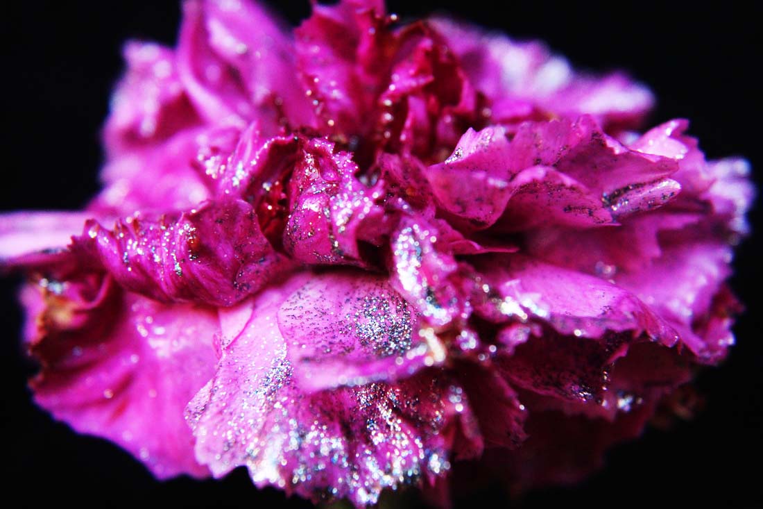
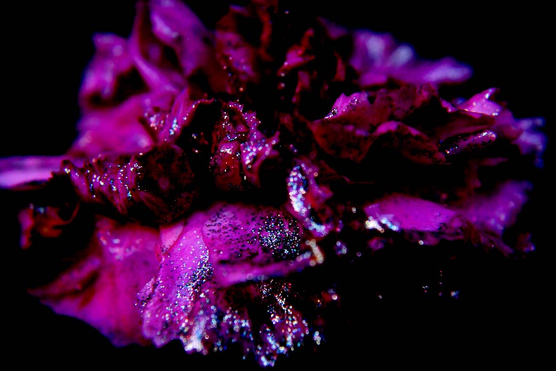
The first photograph is one of my favourites from Kidd as he uses warm tones against a dark background. The use of the macro lens highlights the process of decay the flower is going through. Kidd has manually changed the colour of the flower to make it more asethically leasing to the viewer. He also does this to restore the flower to its once beautiful nature but is also highlighting the beautiful nature of decay. I would like to possibly use this technique but rather photo shop it, I would rather manually do it with either water colour or ink as i feel this would be more vibrant and aesthetically pleasing to the viewer.The second is another of my favourite photographs as it fully fills the frame and centres on the natural decay of the flower. The light used complements the cool tones of the flowers. The use of the dark background highlights the cool tones of the flower and forces the viewer to focus on the colours and decay of the flower. Kidd has artificially enhanced the colours of the deep purple on photo-shop rather the faded and diluted version before. The greens of the stem and leaves are harmonious with the purples, this was a good choice of flowers as the decay is possible and the flowers work well together.
idea sheets

|

|
Artist research - Amalia Veralli


|

|

|


|
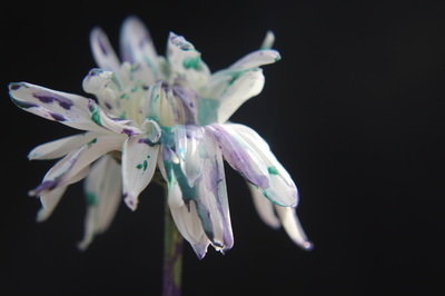
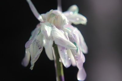
Amalia Veralli's Macro photography is complex. Focusing on one part of a flower or leaf , she explores the depth and colour that isn't usually focused. Her images are set upon a black background that further reveals their natural curves, colour and form. Her macro style reveals a hidden world usually not seen by the human eye. The black background is used to focus the viewer's attention on just the flower and to notice its hidden beauty. Veralli has expertise in macro photography as she says "I photograph my subjects from nature, focusing on one part of a flower,a leaf or ice crystal."
top 2

This is one of my favourite photographs of Veralli's as the warm reds and yellows of the flowers, really contrasts to the dark background. This really highlights the veins and marks of the flowers and it forces the viewer to focus on these aspects of the flower. Some of the photograph is in focus as it accentuates the natural beauty and allows the viewer to appreciate the innate beauty created by the macro lens. This take on macro photography allows Veralli to defy convention and look past the surface of something's beauty.
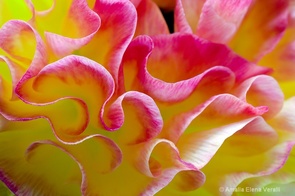
This is also another favourite of Veralli's as it fills the frame and is more in depth than her other photos. The macro lens has magnified the image completely and actually distorts the photo into something you wouldn't associate with flowers. Veralli has chosen the flowers well as the cool yellow of the flower complements the warmer tones of the pinks. The use of the macro lens has been so well used that it has clearly defined the grooves and texture of the flower. Some of this photograph is in focus, whereas some isn't this helps the viewer focus on the more clearly defined in focus parts of the flower.
photoshoot 1
This is my first trial photo-shoot, I'm aiming to use water colour, or bright liquids like food colouring. I prefer a more natural look that this method creates, although i'm using bright colours that aren't obviously natural, you can still see the texture of the flower itself.
top 2
|
|
The first photograph is one of my favourite photographs as I feel it fully fills the frame and attracts the viewer's attention with the bright colours. I like the drips the water colour creates and doesn't take too much attention away from the subject of the photograph . I used only one flower in this photograph, just as my artists do. I let the rose start to wilt and die , the rose naturally started to lose its colour and became pink and a light yellow, I feel complements the water colour well. I have used natural lighting as I feel it helps emanate the cool tint and again goes well with the water colour.The second is also another favourite photograph from this photo-shoot as all the colours complement each other well. The viewer can still see the drips, but in this photograph the watercolour has been absorbed by the rose, this creates a paper like effect synonymous with decaying flowers. In this photograph, I instead used flash, to experiment with the brightness and vibrancy of the watercolours. I feel this technique looks more aesthetically pleasing to the viewer as the yellowness of the flash complements the natural colours well.
photoshoot 2
I am now focusing on one flower like my two artists do and have used more concentrated watercolour and food colouring as I feel this gives life to something that has started to die. I'm using watercolour as I feel it looks more natural, whereas using photo-shop makes it the flower look artificial. It also allows me to have control over the brightness of the colours i'm using

|

|
These are my two favourite photographs from this photo-shoot as I feel the food colouring is bright enough. It also contrasts to the white flower and the viewer can properly see it. I have used a dark background, just as my artists have, this also prevents any distraction and forces the viewer to focus on the flower. I have used the macro lens to focus on the intricate details and veins of the flower, this also helps to fill the frame properly. I have used the essence of Kidd's photography but have adapted it to suit the style of photography I am working with. The second photograph isn't in focus and is over exposed, I did this purposely so the viewer can still see that its a flower but this distorts the viewer's perception. Although I like the fact that photograph is over exposed , I feel as if it looks better in focus so you can properly see the details of thee flowers.
photo-shop outcome

photoshoot 3
The aim of this photo-shoot was to build upon the method in which I apply the ink to the flowers . In this photo-shoot I used a completely different form of colour. I used watercolour instead of food colouring or ink, to see the difference in the two, but also to see which is more aesthetically pleasing .
Top 2
|
|
These are my favourite two photographs from this photo-shoot. In the first photograph I used a rule of thirds so it is aesthetically pleasing for the viewer. I feel the vibrancy of the watercolour is bright enough and contrasts well against the light background. The dark background also helps amplify the brightness and this attracts the attention of the viewer. In both photographs I have used natural light as it looks better and suits the natural theme of the flowers. In the second photograph focuses on the movement of the water colour and the drips it creates. In this photograph I used a fast shutter speed so the viewer gets a sense of this movement.In both I feel I have used my macro lens well as you can see the intricate details of both the watercolour and the veins and grooves of this flower.
photo-shop outcome

|

|
photoshoot 4
The aim of this photo-shoot was to focus on really decaying or decayed flowers. I feel although I liked the colour scheme, I feel the water-colour isn't bold enough and is too diluted.
Top 2
|

|
These are my favourite photographs from this photo-shoot. This is because in the first I feel the water colour I have added compliments the orange well and is harmonious. I feel I have used the macro lens well as the part of the flower I wanted to focus on is in focus, whereas the unnecessary parts aren't in focus. I feel the lighting in both images works well as it is natural so shows the natural state of decay. In the second photograph I have zoomed in to get more of the detail in shot. I feel the drips on second photograph are more in focus and vibrant. Although I think the water colour idea looks effective I feel like I should move on to something more vibrant, for example glitter paint or multicoloured spray.
photoshop experimentation

photo-shoot 5
The aim of this photo-shoot was to move away from the bright water colour idea, and work more towards my artists work .I also wanted to better my use of the macro lens in regards to working with flowers and plants, like the work of Billy Kidd as I don't have much experience with working with macro photography of flowers.
Top 2
|
|
These are my favourite two photographs from this photo-shoot. This is because in the first photograph, the flower is the main subject of the image and subsequently fills the frame. This forces the viewer to pay attention to only the flower. I used natural light, to bring out the colours of the flower but also the colours of the glitter spray. The glitter spray is giving the flower a new lease of life. The second of the photographs, is more like the artists I have researched so I feel I have imitated the work of the photographers with the use of the macro lens. I feel like I have used the macro lens well as the parts of the flower I want the viewer to focus on are in focus.
Photoshop expermientation
|

|

|
|
photo-shoot 6
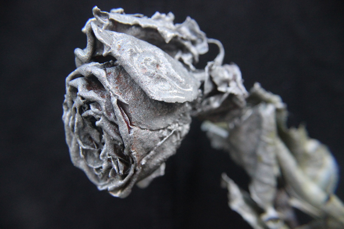
In this photo-shoot I have aimed to show a wide range of flowers in the process of decay. I feel this photo-shoot went well as I feel I have used the right style, also the right method in which the artists I have researched have. I think the addition of the multicoloured glitter spray and the silver spray really brings life to the rose that is clearly decayed.
top 2

|
|
These are my two favourite photographs from this photo-shoot as I feel I have imitated Billy Kidd's style of photography. I feel in the first photograph the amount of silver spray to multicoloured spray works well as it brings back the lease of life the rose once had. I let the rose decay completely so it makes the decay obvious and it brings a sense of texture to the photograph. I have used the macro lens in both photographs so you can see the intricate detail of the flower,.but have also used split focus to draw the attention of the viewer away from the less important parts of the image. In the second photograph I have specially used a different view of the flower. This is to ensure the viewer gets to appreciate more parts of the flower. In both I have used a dark background so the viewer only focuses on the subject of the image.I feel using this side view you get a better idea of the point in which the flower has decomposed to as the petals and leafs are turned up and crispy.
photo-shop outcome
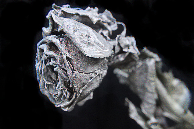
photo-shoot 7
I feel I have finally got to the point in this unit when I know what I wanted from a photo-shoot. In this photo-shoot I wanted a feeling of purity to be conveyed ( why I used a white flower). I feel the right amount of glitter spray has been used and looks better than being photo-shopped as
photoshop tutorial

Firstly, I duplicated the layer to ensure that if any mistakes are made I can remove them easily.

I then adjusted the colour balance, it made the photograph look more vibrant.

Although I adjusted the brightness and contrast and the colour balance, I still felt the photograph looked too dull so I also adjusted the vibrance.
|
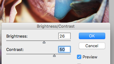
I then adjusted the brightness and contrast as the photograph preciously looked dull.

Like the photographer I am using, I have sharpened the image to capture all the intricate details.

Final Outcome
|
FINAL PIECES


|


|
